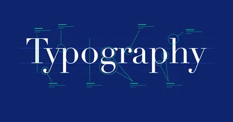
In the vast realm of visual communication, fonts are the silent storytellers. They shape the way we perceive information, influencing emotions, guiding comprehension, and ultimately, weaving a narrative through the very style of font. But fonts are not a monolithic entity. Each style – serif, sans-serif, script, decorative – carries a unique voice and personality, ready to elevate your message if chosen strategically. Let’s delve deeper into this fascinating world, exploring the different font styles, their emotional impact, and how to leverage their power to create impactful communication.
The Font Family Tree: Understanding the Core Styles
Fonts come in families, sharing a core design aesthetic while offering variations in weight, style, and width. However, the primary categorization lies in their broad styles:
- Serif: Distinguished by their decorative flourishes at the ends of strokes, serifs evoke a sense of tradition, authority, and elegance. Think of classic novels or legal documents, where serif fonts like Garamond or Times New Roman lend a sense of timelessness and trust.
- Sans-serif: Meaning “without serif,” these fonts embrace clean lines and a minimalist aesthetic. They project a modern and approachable feel, making them ideal for websites, tech products, or contemporary marketing materials. Helvetica, Arial, and Proxima Nova are popular examples.
- Script: Inspired by handwriting, script fonts add a touch of personality and informality. They lend a playful or whimsical tone, perfect for invitations, greeting cards, or social media posts where a more personal touch is desired. Examples include Lucida Handwriting or Lobster.
- Decorative: These fonts deviate significantly from standard letterforms, incorporating unique shapes, ornaments, or unusual styles. While eye-catching, they can be less readable and are best used sparingly, often for headlines or short bursts of text. Think of invitations with a flourish or vintage-themed posters that use decorative fonts to enhance the nostalgic atmosphere.
The Psychology of Font Style: How They Shape Perception
Beyond aesthetics, font styles carry a subtle psychological weight, influencing how your message is perceived:
- Serif vs. Sans-serif: Studies suggest serif fonts are perceived as more trustworthy and reliable, while sans-serif fonts are seen as modern and approachable. Imagine a financial institution’s website – a serif font would likely inspire greater confidence than a playful script font.
- Script Fonts: These fonts can evoke a sense of warmth, friendliness, and informality. They create a more casual and personal atmosphere, suitable for handwritten notes or invitations to a social gathering.
- Decorative Fonts: The emotional impact heavily depends on the specific design elements. Ornate and elaborate fonts might convey a sense of luxury or grandeur, while quirky and playful fonts inject a touch of fun and lightheartedness.
Choosing the Right Font Style for the Right Message: A Strategic Approach
Effectively communicating your message requires a strategic approach to font style selection. Here are some key factors to consider:
- Target Audience: Understanding your audience’s demographics and preferences is crucial. Choose fonts that resonate with them and align with the overall tone of your communication. A children’s book aimed at young readers might benefit from a playful script font, while a research paper would likely opt for a more formal serif font.
- Communication Objective: Are you aiming to inform, persuade, or entertain? Match your font style to the desired outcome.
- Platform and Medium: Consider where your message will be displayed. Some fonts may not render well on mobile screens, while others might offer limited accessibility options. For example, decorative fonts might look stunning on a printed poster but could be difficult to read on a website.
- Readability is Paramount: Even the most visually striking font should prioritize clear communication. Prioritize clarity over intricate details if your message involves large blocks of text.
Beyond Selection: Optimizing Font Style for Maximum Impact
Choosing the right font style is just the beginning. Here are some additional tips to optimize it for impact:
- Hierarchy and Emphasis: Use different font styles to create a hierarchy of information. Headlines in bolder styles like serif or bold sans-serif grab attention, while body text in a more classic style like regular sans-serif ensures readability.
- Style Combinations: While there’s an inherent beauty in a single font style, strategic combinations can enhance the visual appeal and message delivery. For example, a formal serif font for the main text and a playful script font for a call to action can create a sense of authority while injecting a touch of personality.
- White Space and Alignment: Break up large blocks of text with appropriate line lengths and spacing between lines and paragraphs to create visual breathing room. Alignment (left, right, or justified) can influence the rhythm and flow of the message.


